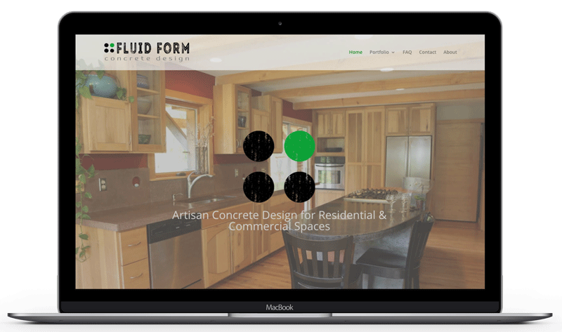
We’re excited to have launched a new website and logo for Fluid Form Concrete Design, a high end concrete designer and fabricator for residential and commercial spaces. Fluid Form is based in Brevard NC and serves western North Carolina, as well as, upstate South Carolina.
The goal for the website was to create a portfolio for clients and potential clients to see the possibilities of concrete, as well as find inspiration for their own projects. With that in mind, we went with a highly visual layout with large full width images for the homepage and galleries making up the majority of the pages. Rather than doing a full size image on each page, we used a shorter image, partially hidden behind a translucent menu bar, to highlight the detail and texture possibilities of concrete.
For the logo, the client wanted to incorporate the four dots idea. We went with a font that had some texture to reference concrete and used that same texture in the dots. The grey color of ‘Concrete Design’ again gives the idea of concrete and provides a solid base for “Fluid Form”. The single green dot represents the unique and customized nature of Fluid Form’s product.
We wish Fluid Form Design the best of luck, and having seen their finished products, know that they will find great success.

