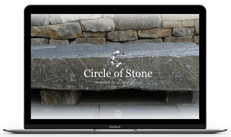
David Reed, owner and designer at Circle of Stone, has been creating handcrafted stonework across Western North Carolina for over 30 years. After relocating to Brevard, NC, David wanted to update his website and give it a more modern and visual feel, and have it be responsive across different devices.
When David approached Spark Media Collective, he had an existing website that served its purpose, but was little dated both visually and functionally. So, we set out to help him bring his site up to speed on both fronts.
The goal was provide an online platform where Circle of Stone could showcase the variety and quality of stonework that they offer. With decades of creating beautiful landscapes, it was a natural fit to go as visual as possible and let the pictures do the talking. We went with full-size images on the homepage, with each one acting as a menu option. Each page continues the theme of having a full background image behind text or a plain background with gallery images in front.
In addition to designing and creating stonework, David has written 2 books over the years and a third book, The Complete Guide to Stonescaping, which is an updated combination of the first 2 books. We highlight the book at the bottom of the homepage, as well as give it its own page with menu link. This gives the book high visibility without cluttering every page with a “buy now” link.
There are a number of things that we did to “modernize” the Circle of Stone website. The most important being responsiveness. When viewing the website on a mobile device (tablet or phone), the website does not simply shrink to fit the screen, but rather re-structures to optimize the user experience on whatever device they are on. The menu becomes tucked away, as to not clutter the limited screen space. Images are resized and text is adjusted for easier viewing and reading. It continues to adjust to landscape or portrait orientation of the device. Additionally, we added buttons to emphasize “call to actions”. Contact, buy now, menu items…any action items that we wanted to encourage users to take.
With high quality images, responsive design and a modern layout, we were able to give Circle of Stone an updated look, regardless of what device the user is on.


